EPL 2023: Kit rankings, every kit, Premier League kits 23/24, Arsenal, Manchester City, Liverpool, Manchester United, Tottenham, latest, updates

A new Premier League season brings new stadiums, some new players but more importantly, new kits.
For the jersey enthusiasts among us, the lead-up to the season is like Christmas as teams release their new kits left, right and centre.
Some sections of fans will curse their team for daring to partner with certain manufacturers while others will be quick to sleep with the shirt in their bed like a child cuddles a stuffed toy.
Granted, these rankings have arrived well after the season has kicked off.
But, if anything, it’s allowed this reporter to further justify the ratings having seen them on the field as opposed to the marketing shoots.
Without further ado, here’s Foxsports.com.au’s 23/24 Premier League Kit Rankings!
Stream Over 50 Sports Live & On-Demand with Kayo. Join now and start streaming instantly >
Ronaldo goes NUCLEAR at referee | 00:33
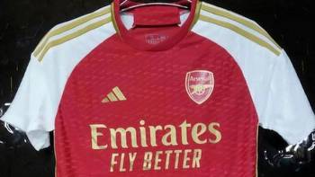
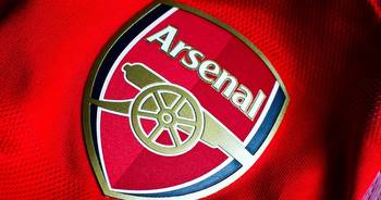
Arsenal
Arsenal and adidas partnership has once again delivered a solid kit.
But the gold trim on the sleeves and badge do leave some questions.
The marketing speak is that the gold touches are a tribute for the 20th anniversary of the Gunners’ ‘Invincibles’ season in the 2003/04 campaign.
They’ve even added Arsenal’s record from that season somewhere on the jersey because Gunners fans reminding you they are the only club to go undefeated for a full Premier League season wasn’t enough.
However, we have our suspicions the gold touches were applied in the hope Arsenal would go on to win last season’s Premier League title given how far ahead the design process begins.
At the end of the day, it probably depends on who you ask.
Rating: 8
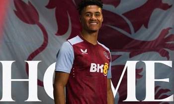
Aston Villa
What in the Burnley circa-2011 monstrosity is this?
The mid-tier sponsor, the tacky design supposedly inspired by soundwaves taken from fans singing at Villa Park, it just doesn’t work.
At least this jersey might end up being a collector’s item with the new badge on the shirt.
But even that has an embarrassing backstory given the club’s fans voted for it last season as their new badge, only for Villa to hold fire on rolling out the badge on a full-time basis, meaning this one is a tribute to the 1982 team who won the Champions League.
A very chaotic kit in every possible way.
Rating: 3.5
Bournemouth
Hold on a minute, the black stripes are thicker than the red ones?
Is this the end of days?
Probably not.
But it’s a cool and inoffensive way to usher in a new era at Bournemouth under Andoni Iraola as the Cherries don a kit that makes them look like AC Milan.
Rating: 6
Brentford
Brentford has once again adopted the two-year kit cycle, meaning this one will be in the rotation for this year and the next, so kudos to the Bees for that move.
But if you’re going to take that approach, at least serve up something better than this.
The black patches under the arm and on the collar look out of place and take away from what could very easily be a great kit.
There’s also the sad element of being sponsored by a betting company when their best player was diagnosed with a gambling addiction.
Rating: 5
Brighton
The strange yellow pinstripe on last season’s Brighton’s shirt has vanished and been replaced by, well, nothing.
The Seagulls have returned to their traditional blue and white stripes, finally moving away from trying to anything and everything to jazz up what is a very simple design brief.
It’s certainly worked well for this year’s jersey, although Brighton fans will be careful not to buy it with any youngster’s name on the back given they’ll probably be sold in the next three years to Chelsea.
Rating: 6
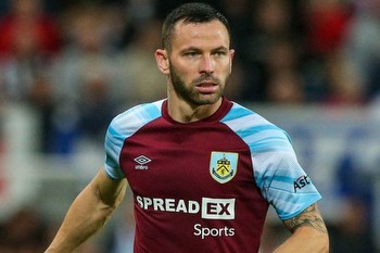
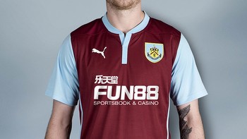
Burnley
Somehow it appears Castore and Umbro’s designs for Aston Villa and Burnley respectively fell into the wrong hands.
Because this Burnley kit just screams Aston Villa.
On an unrelated but equally amusing note, it’s great to see W88 keep up their insane record for sponsoring a promoted team.
They were on the front of Wolves’ jersey in 2018, Villa’s in 2019, Fulham’s last season and now Burnley.
But back to the kit.
No matter how Vincent Kompany’s troops get on this season, at least they’ll do it in style.
Rating: 8
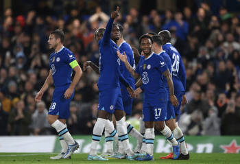
Chelsea
Not even a funky 90s-themed photo shoot is enough for this Chelsea shirt to really make its mark.
The Blues supposedly took inspiration from the kit they wore in 1997/98, but that’s a little hard to stomach when that one had a collar and this does not.
The kit also features an iridescent Chelsea and Nike badge which, according to the kit release, “highlights the prestige and glamour of the famous King’s Road in the 90s.”
Well, if you secure your worst league finish in almost 30 years having spent silly amounts in the transfer market, perhaps it really is best to keep thinking about the good ol’ glory days.
Rating: 6
Crystal Palace
Oh dear.
Crystal Palace have abandoned their usual stripes and gone for the half-and-half jersey split.
The Eagles’ kit is inspired by the 10-year anniversary of returning back to the Premier League, a frightening prospect if that’s how recent teams will go to justify a retro design.
They went for a half-and-half split back then and it didn’t look quite right, even if our very own Mile Jedinak led the team back then.
There’s also an added touch of the Crystal Palace monument on the jersey which is where the club was founded, although those who know their history will know the final fate of that building was not a happy one.
It adds something extra to the shirt, but it’s difficult to see it on the red half which basically makes it redundant.
Can we just go back to the happy little crayon squiggles they had last year?
Rating: 3
Everton
Less really is more.
Everton have kept it simple for this year’s kit, which is basically a blue polo with a white collar.
But wait! There’s some minor design elements!
Aside from the traditional Hummel chevrons on the shoulders, the collar features a nod to the old stands at Goodison Park in a fitting tribute to the famous stadium given it is the Toffees’ last season there before moving to their fancy new ground on the Bramley-Moore Dock.
But given Everton’s on-field struggles and failure to address glaring needs in the transfer market, Goodison Park might not be the only thing the Merseyside club moves on from at the end of the season.
Rating: 7
Fulham
No. Just no.
Crystal Palace might have gone for the half-and-half kit as a whole, but Fulham doing that for the stripes?
Call us a sucker for symmetry, but it just doesn’t look right.
It’s either all-in or the red stripes or the white stripes, you don’t get to dip your fingers into both pies.
If Fulham went for only red or white stripes, this rating would be significantly higher.
Alas, they did not and therefore their rating is not.
Rating: 4
Liverpool
Liverpool have really tested the design waters with this year’s number.
Having gone for a plain red jersey last season in seriously groundbreaking areas, Liverpool have tacked on a white trim on the neck and sleeves!
Granted, it’s meant to be a throwback to the Reds’ 1973/74 jersey which, upon investigation looks exactly the same.
As mentioned earlier, less can be more in the world of kits but for Liverpool to pull off two incredibly basic designs in consecutive years reeks of laziness.
Rating: 4.5
Luton Town
If ever there was a jersey that gave off serious 2000s Coca-Cola Championship vibes, this is the holy grail.
Unfortunately for Luton, orange is a colour that’s rather difficult to work with when it comes to kits but they’ve at least made an effort.
But we haven’t had an orange home kit in the Premier League since the days of Blackpool, so it’s a welcome change.
Sadly for the Hatters, it’s hard to see this jersey befitting a team likely to survive the drop.
Rating: 5
Manchester City
Shut up and take our money.
Puma have dished up some serious clangers over the years (the away kits for their World Cup teams in Qatar, anyone?) but credit where credit is due, they deliver when it comes to their Manchester City kits.
The collar is perfect and so too is the design of the spiralling walkways outside the Etihad Stadium.
We can’t put emojis in these stories but if we could, one of a chef’s kiss would perfectly encapsulate City’s jersey.
Rating: 9
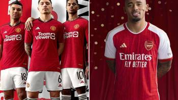
Manchester United
There’s just something about black accents on a Manchester United jersey that feels so right.
Adidas have once again delivered for the Red Devils this season, while the Team Viewer logo also managed to somehow grow in size.
The most intriguing design element of this kit is the incorporation of the Lancashire Rose in the form of the pattern on the Trafford Road Bridge.
Well, at least that’s how it was explained when the kit was released.
Otherwise it’s just a bunch of incredibly confusing lines that made little sense.
Rating: 7.5
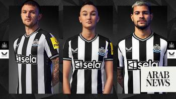
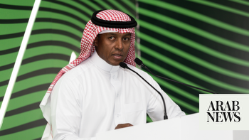
Newcastle United
It’s rare to hear the words “Castore” and “good kit” in the same sentence, but here we are.
They’ve served up a quality kit for Newcastle this year as they return to the Champions League, even if it is alarmingly similar to last year’s.
The key differences are the shape of the collar and having dominant black stripes instead of white ones as well as losing the blue Castore logo and sponsor.
However, the Magpies do lose points for having a very questionable front-of-shirt sponsor.
They inked a £25 million-a-season deal with a company called Sela, a Saudi Arabian events company who are owned by the nation’s Public Investment Fund (PIF)
Conveniently, the PIF owns 80 per cent of Newcastle.
For reference, Newcastle’s previous sponsor Fun88 paid £6.5 million-a-year to feature on the front of their kit.
The Premier League gave the green light for Sela’s sponsorship but it has done little to stop the questions from fans regarding the deal being fair market value.
On a more positive note for Toon fans, this year is Castore’s last as the club’s manufacturer with Adidas set to take over from next season.
All’s well that ends well?
Rating: 8
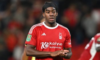
Nottingham Forest
A quick glance at Nottingham Forest’s online club shop shows states their home kit is available for $AUD125.
That’s awfully expensive for a kit that’s essentially a glorified template kit with a Forest badge slapped on.
Seriously, you could save yourself plenty of cash if you hopped on adidas’ website, picked out a red sport shirt and got someone to stitch on the club’s badge.
It’s borderline pathetic how little effort has gone into this Forest shirt.
Rating: 2
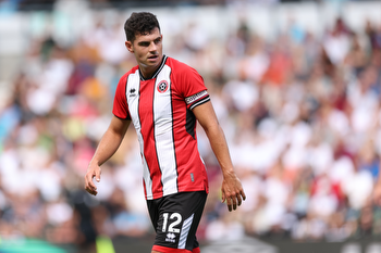
Sheffield United
Brentford, take note.
Sheffield United have shown how you jazz up a red-and-white-striped kit without going overboard with the design.
The kit oozes class which is a real shame given there could be a serious lack of it on the field given the quality of the Blades’ squad.
Rating: 7
Tottenham Hotspur
If there was ever a shirt that made you just shrug your shoulders and say, “meh,” then this would take the cake.
It fills the main objective of a Tottenham kit in that it’s white, which is pretty hard to mess up.
The blue trim on the cuffs are kind of cool?
We’re really having to clutch at straws here to find anything interesting about this one.
Lucky that Spurs have Ange Postecoglou at the wheel to make up for lack of excitement when it comes to the design on the kit.
Rating: 6
West Ham United
We get it, West Ham, bubbles are your thing!
You have the song, you have the bubbles before the game but do we really need bubbles on a jersey?
Without the bubbles, this would be a quality kit for the Hammers but the bubbles add an unnecessary and childish touch to it.
It’s not for us.
But if that fish from Finding Nemo who exclaims “bubbles” every time he sees a bubble in the fish tank was doing these ratings, it would be a different story.
Rating: 4.5
Wolves
Honestly, we’re struggling to find anything wrong with this kit.
The black and white on the collar complements the dominant ‘old gold’ perfectly.
Sometimes there really isn’t much that needs to be said for a kit and that’s the case with this Wolves number.